Time for the big logo bash. We actually need two logos:
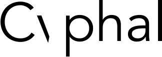
- The Cyphal technology logo
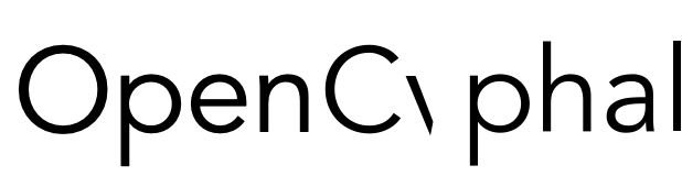
- OpenCyphal’s organizational logo
I’ll start and we can do this free-for-all until something emerges.
Time for the big logo bash. We actually need two logos:
I’ll start and we can do this free-for-all until something emerges.
Hah, bikeshedding — my favorite part.
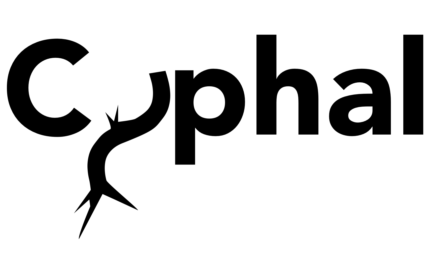
I think you lost part of your y. Here, take mine: /
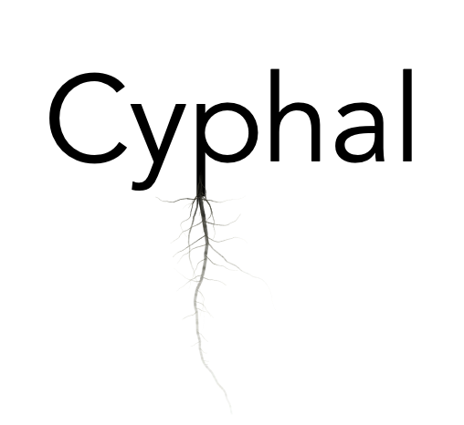
I like the root structure but should it not be spanning left and right rather than downward to keep the aspect ratio manageable? Like this:
Are we going to discard the color theme you created earlier or is it still applicable? Here it is, and I like it:
I approve of the choice of color but the appendage underneath the C makes little sense on its own. If it were to be attached to the bus spanning side-to-side, like it is in the current UAVCAN logo, that would make a lot of sense.
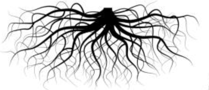
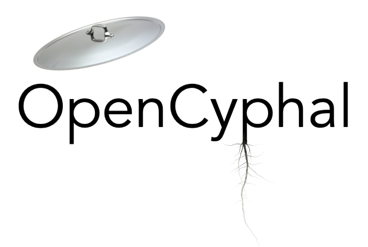
Speaking about OpenCyphal specifically, I think the logo should do a better job of emphasizing openness. By looking at the following image you can clearly tell that this particular Cyphal is, indeed, Open:
The hyphae can be more horizontal and more digital in nature to emphasize the “Cyber” part of the portmanteau.
This is generated by Context Free Design Grammar.
An abstraction?
This one is inspired by Hartig Networks where the hyphal structures intrude into the outer layer of tree roots to exchange nutrients.
not bad
I don’t think it’s readable.
Are we ready to put up a poll?
0 voters
Yeah, I think we are ready to run the poll. Actually I suspect we have already reached the consensus.
Okay. If we like the abstract logo then:
0 voters
To clarify this is the OpenCyphal project logo. I’m not sure if Cyphal itself needs a logo, actually, now that I think about it.
I’m not feeling strong about the Cyphal logo, but really logos are a bit more than something glued together in a fashion. At least I always let mine create by a designer and it’s worth every  .
.
![]()
![]()
![]()
![]()
Note: This is how snowfox logo looked like when I tried to have it handled via fiverr:
![]()
I think the improvement is visible 
Ugh, we don’t have time for this I guess. Let’s just go with some font that reuses the same colour scheme but just says “OpenCyphal” with no decoration and we can circle back to this later.
0 voters