Hah, bikeshedding — my favorite part.
I think you lost part of your y. Here, take mine: /
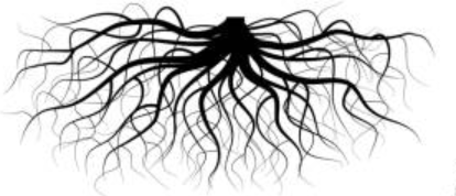
I like the root structure but should it not be spanning left and right rather than downward to keep the aspect ratio manageable? Like this:
Are we going to discard the color theme you created earlier or is it still applicable? Here it is, and I like it:
I approve of the choice of color but the appendage underneath the C makes little sense on its own. If it were to be attached to the bus spanning side-to-side, like it is in the current UAVCAN logo, that would make a lot of sense.