While we’re listing deficiencies: one problem with the old design is that the UI often becomes unresponsive when attached to a very busy system. Remember that some views will be dealing with things that can number in the many hundreds of thousands and that can change at very high frequencies. Because of this it’s essential to avoid creating performance bottlenecks across the REST interface. The UI must deal with paged views into large datasets and the python server must provide ways of coalescing high frequency events before updating the state of the UI.
Again, let’s look at something like “peek”. I really don’t want a lot of modal dialogs in the UI.
Just to throw my random two cents in, using an abstract representation like JSON or msgpack would be great. The more you can leverage slow changing solid 3rd party components, the faster everything will go.
Also, the peek interaction would work nicely for things you only need to see rarely, like type or bit depth. There might be a way to expand that later if that’s useful.
That’s kindof what I mean, but how are you going to face the problem Pavel addressed: You might want to select an arbitrary number of parameters that accept the same data type and batch-edit them. I imagine some two-row UI: The top part contains the register tree view, with all the filtering, flags, etc and then on the bottom, is the ‘current register workset’ : the homogenous (same data type) selected registers to batch-edit along with their target nodes and some buttons: remove from the working set, batch update all, etc.
Individually editing by clicking an edit button on the tree or on the working set row below, can be like the vscode window, or inline, or with a popup. Batch editing would not need a popup since we have something showcasing what we are working with below.
EDIT: With many many nodes displayed, I’m not sure if it makes sense to have each one displayed on a separate column, but the batch editor is a must.
Filtering: The node list homepage is meant to be a very quick overview of what’s on the bus: filter supports regexes as well and matches against all the attributes of the current node list response [id, name, health, status, vendor code] and supports sorting based on these attributes, ascending or descending order.
On the batch register editor, I think it makes sense to change that a bit. Split the filter on flags and arbitrary text provided. The text matches by regex or by .contains() the register name. Aside from that, we can have flags like lifetime:PM (lifetime: persistent and mutable) or simply lt:P and other shortcuts like that to make this usable.
I’m not sure if it makes sense to keep the current ‘expanded’ node details UI I posted on github:

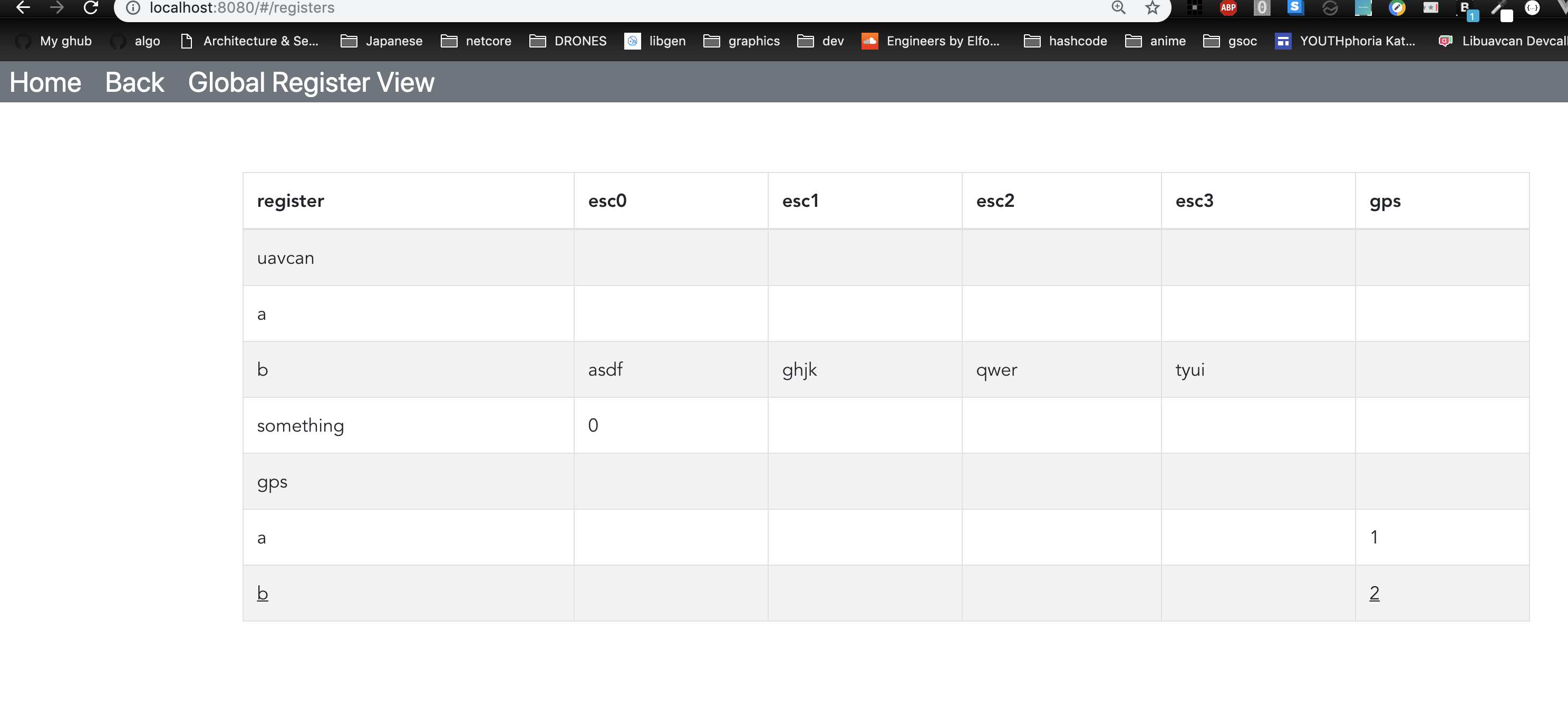
The crucial idea is that we take all registers from all nodes and join them into one view, so that the human developer can easily assess, compare, and modify all changeable and/or observable variables of the entire UAVCAN network from one place. There are huge possibilities for various semantic highlights and advanced features that can be added incrementally; for example, the user could ask the view to highlight rows that contain distinct (non-uniform) parameter values, or parameters that differ from their default values, etc.
Can we call this thing “Global Register View”?
There should be a way of viewing the node details (such as the CoA, version info, and so on) and issuing commands (reboot, shutdown, vendor-specific, etc). Viewing the node’s registers is optional since that function would overlap with the global register view. I’m not sure what’s the best way to implement that in the sense of UX.
Here’s a first prototype of the global register view (it’s dynamic, meaning It’s being generated from the data model). Some things are missing, like collapse and expand
are missing, but I’m adding these as we speak.
Some questions regarding the Global Register View
- How are we going to show current register mutability, persistency, value, it’s data type, min/max (if they exist)?
- Do you have anything in mind for select for batch edit / edit individually controls? Buttons, colors, etc ?
- Shall I add another panel on the bottom, showing the selected commands for batch editing ?
I am starting to think about the implementation of plotter tool too. We are probably going to use a simple websocket to stream new data to the frontend (or whatever consuming client). Is the UI-UX going to be the same as the old gui-tool , or are we going to drastically redesign it like the register view?
Yesterdays notes on the devcall (forgot to post):
- Start the global register view which is supposed to be a view on all the bus variability.
- Postpone the design of the register types on the API side
- Rename every ‘parameter’ thing to ‘register’
- Things are in a highly WIP state, focus on prototyping, write tests upon each feature completion
- Research a bit on third party component registration and dynamic integration
P.S. UAVCAN is the most important and challenging computer engineering thing I’ve messed with. Being part of the team feels great. Keep up the good work guys 
1 Like
The value could be displayed as-is on the rich cell. If the value doesn’t fit, it will have to be truncated; probably there should be a separate GUI element for displaying the value (also min/max/default) of the currently selected register in its unabridged form; for example, an array of 128 float16 values might be challenging to display adequately within the constraints of a single cell, but it should be fine to display in a larger element somewhere on the side or below the main register table. Min/max/default values could be either shown on the bottom row of the same rich cell, or they could be only displayed on the “detailed view element” as above. The flags (mutable vs immutable, persistent vs. volatile) could be either shown as icons (the way it is done in Kucher, as you can see on the screenshot I have posted) or they could be somehow reflected in the style of the rich cell.
The detailed register view should allow the user to select the preferred representation. For example, numerical arrays could be semantically lists or matrices.
Maybe the detailed view could also be somehow joined together with the batch editor? E.g., when the user selects multiple registers, their detailed views pop up below the table, allowing the user to somehow edit all of them at once (I have no idea what am I talking about).
Personally I don’t like GUI that hide information, so if there is a choice, I would lean on the side of showing as much information as we can at once; we shouldn’t require the user to click around to get what they want.
Notice that in order to know which registers are available on a given node, we have to discover them by calling uavcan.register.List. The discovery process is slow as there may be hundreds of registers per node and hundreds of nodes on the network. Luckily, the spec requires that the set of registers is to stay constant as long as a node is running, so we only need to load the register set once and then it can be cached (either on the front end or the back end) until the node is restarted. We could take further shortcuts and bind each cached set of registers with the node’s unique ID, so that when a node whose registers we queried earlier is reconnected/restarted, we could identify it by the UID and continue using its old registers while updating the cache in the background. This is something that can be implemented incrementally later though.
Could you incorporate the following use case please: the user selects a register and asks the GUI to poll it with a specified frequency while adding every returned value onto the plot? If the register is array-typed, there will be multiple lines/plots created, or the user could be explicitly asked which elements of the array to plot.
Let’s just say that I am personally very open to suggestions. Data visualization is hard; in the case of UAVCAN it is, I dare say, very hard. Whatever we end up with should be very extensible and generic so that we could support new use cases and new visualization strategies in the future.
There are known issues with the current plotting UX:
- The data field selector is limited in functionality: it may suggest data elements which cannot be plotted (e.g., compound types), and it can only show suggestions for the first entered field; e.g. when you enter
msg.voltage, you get a list of suggestions, but if you were to entermsg.voltage * msg.current, the list would fail to show up aftervoltage. - The correctness of the entered math expression is not validated; e.g.
msg.temperature-273.15is a valid expression, butmsg.temperature-is not; the GUI would fail to warn you in the latter case. - It is currently impossible to define plotting expressions that span across independent messages. For example, if you want to plot electrical power based on the voltage value from one message and a current value from another message, you’re out of luck.
- It is currently impossible to make the plotting engine poll a specific service and plot a particular response field.
- The set of available visualizations is limited. Ideally there should be a library of representations such as histograms, 3D plots, surface plots, etc. They can be very handy when working with complex systems, e.g. when tuning a set of sensorless FOC propeller drives. Currently we only support simple time-Y and X-Y plots.
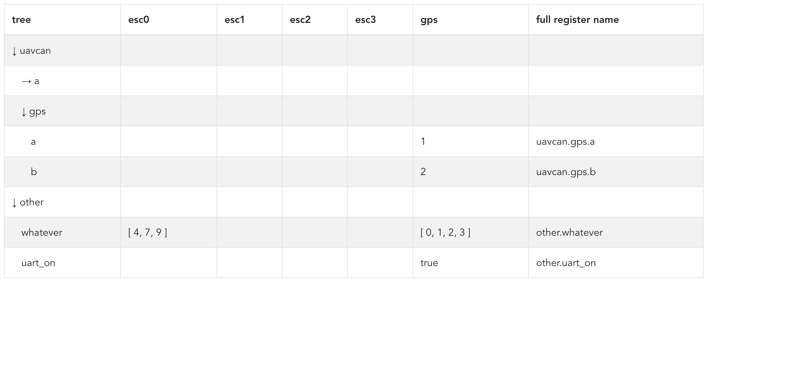
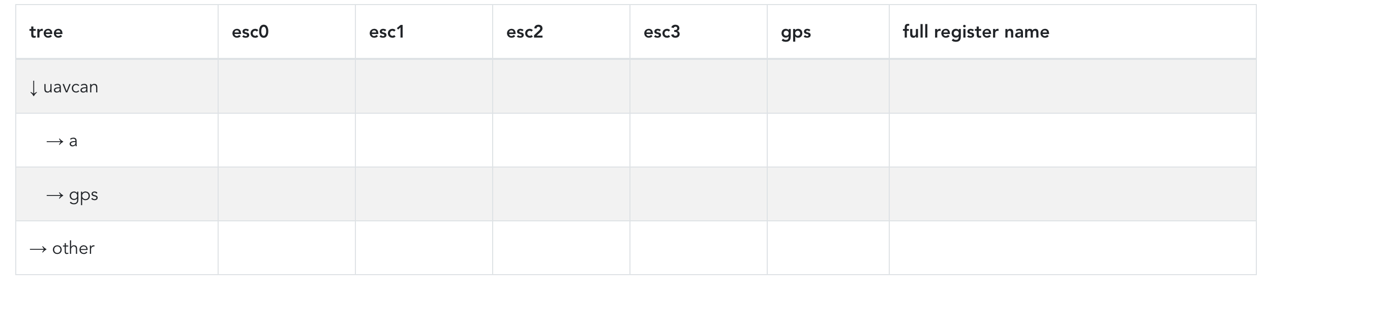
I just finished doing the collapse-uncollapse action:
- Does it make sense to have editable registers show up as clickable? Clicking would mark them selected for batch editing, or present a tiny popup that selects either individual editing or add to batch edit queue? I’m asking this because it would make sense to have the value style (black text-blue clickable link) represent editability/mutability and then have something extra on the side to represent volatility / persistency (maybe we can change the text colour as well). If we are to have this on the side, it would make sense to only have an icon for the least common case (volatility-persistency), perhaps only showing it when the parameter is volatile (or persistent), to reduce clutter.
- It makes sense caching this on the backend. Heck, we can even use some cache control headers to avoid extra un-needed transfers
- I think we should indeed have some default truncated value length and some default representation, but we need to know first, how we are going to pass around primitive and composite types first (even custom ones).
- On the bottom, I can show a non-truncated view for the selected parameter set and if homogenous, allow batch editing.
- Filters: I add one for register names, one for node names, some toggles for register flags (mutability, persistency), right?
Plotter stuff:
- We can even have this subscribe to a filtered (by regex) data stream and render everything with a different colour.
- Yes, we have the dimensionality problem again, because we need a way to visualise whatever data is available. Some possible aggregations could be added as well: ex. render a vector3 as element1 + element2 + element3, or on individual axes (multiple dimensions), or as individual lines on the value-time plane.
- Turing completeness could be very easy to add, as you can on the fly evaluate chunks of javascript code: HUZZAH : we can have people writing their own rendering logic, with a tiny API (if our small configurable set of actions are not sufficient)
Perhaps. I think you’re best equipped at the moment to make judgements of that kind because you have your UI in front of you and you can see what works and what doesn’t. Further, let me provide you with a few UAVCAN hardware units as soon as we have anything that runs UAVCAN v1.0 (that is still some months away though) so that you can test things seriously (please PM me your address). Mocks are helpful but they are never as helpful as real hardware.
Right, but please remember that some nodes may not have names, only node ID, so that should be filterable too.
If name is not found, then match against ID: does that make sense?
Or perhaps, in order for the UI not to be limiting, we can have it either as a separate id textfield to match against, or a name:input id:input on the same text field (At this point I’d say it makes sense to have 2 separate text fields).
I will PM my address as soon as the hardware is ready ![]()
It should be either a separate field or a separate filter parameter (like id:123).
I guess something like this makes sense:

Where is the ‘register working set’ supposed to be? (With the full data previews) and stuff? Ontop would make sense, because the size of the table would be huge in both dimensions. I don’t want this on a different tab, it would ruin the ux. Do you agree with that?
Nevermind the awful navigation bar on the top, thats not it’s final form. @scottdixon
I see you added navigation screen layout on github. I like that. Does anybody have some suggestion to make or shall I go ahead and prototype that navigation as well?
I totally agree on all points. Which reminds me about another suggestion I had in mind:
Yukon is going to be a tool made for developers in the first order. I think it might be sensible to assume that many developers use large high-DPI screens, and it would be poor UX design if the software ended up being overly optimized for smaller screens while neglecting the capabilities of more advanced setups. I propose that we avoid attempts at optimizing the UI for screens smaller than 15.4" Full HD, otherwise we’re risking the quality of the final product for the main user base. This applies only to desktop systems; I am not saying that we shouldn’t eventually support mobile devices – that environment will likely require a very different approach.
Practically that means that Yukon should avoid fixed-width layouts. When I open, say, the register view or a plotter UI on a 27" 4K display, I want it to take all of the space available on my screen.
Fixed point layouts are of course, not going to be used, nor are being currently used.
We are using bootstrap, which is responsive by design, so variable screen sizes are not a problem. Mobile would probably need a much different UI, but that’s another story – possible a much smaller feature set optimised for such use.
Elements just wrap on a second+ row on smaller screens. I’m developing on a 13.3" MacBook Pro (Optimized for space) and on a 24" screen fullhd desktop. Worse case, as screen size goes down, elements wrap on multiple rows.
Imagine that the table is going to infinitely expand on right and on down dimension. That said, if we are to place the working set below, it would always be on the bottom of the (huge) table. I just think it would be more accessible at the top, before it.
I think this is a fine idea.It would be awesome if the “one box” navigation box at the top worked like vscode or osx spotlight where you hit a control key sequence that brings up a text input providing better mouse-less navigation.
I don’t think this makes sense for the navbar ux. You’re not editing much text and strictly directory-based stuff, like vscode. At least, it does not make sense for the current state of development. I can’t imagine cross-app actions that you would want to do; Maybe some shortcuts scoped inside components would make sense, but we can add these later (possibly only shortcuts) if proven necessary for a good workflow.
Yukon Frontend Feature List as of now
- Navigation bar on top
- ‘Home’ View, which is essentially the list of active nodes
- Global Register View (incomplete)
- Node Details by Id (includes specific node’s register list – we need to keep that, not everybody is up to viewing the entire bus variability, just to check one node’s parameters)
Things to add/improve on the existing feature set:
- Maybe, on the home screen, we can have another component sitting on top of the node list view, potentially showcasing important stuff going on the bus (ex. Node Updates, messages of high/exceptional importance (debug or not) - whatever, you name it.
- Global Register Workset : The set of selected registers planned for batch editing (or viewing). Although, viewing the non-compact representation of the types that require a big amount of screen space - bigger than a small table cell - like matrices, arrays of reals, can be viewed as a hover-over on the value cell.
- Batch Editing: Register values can update 1 by 1, so we need to keep track of what updated sucessfully and what did not. Also, if everything succeeds, show an optional button of clearing the current workset, or, change it to the register set that failed to update, or retry.
- Export & Import Register Views: The file should probably be csv and json, but the output data format has not been decided yet.
Features that need extra research (for now):
- Representation of primitive, public and third party data types over JSON, along with a generic all-around value displayer (trimmed/compact representation included) and editor (the same editor and value displayer will be used on both GRV and Node Details).
- Bus Message Logging: This is going to be implemented with a websocket that streams data to each frontend. The first layer of filtering is going to be performed on the backend, along with each new bus listener subscription request , to avoid wasting resources and to transfer less data over the network. Then, extra filtering and processing can be implemented on the frontend. Resuming would probably be a new subscription request and data stream. We can then, let the user export all this logging at once: All-together, or different files (one per each session [meaning one per start-stop-resume], one per each data type, one with the data types matching some regex). This is all the usability details I’m able to come up with now. @pavel.kirienko Is the old UI of the logger sufficient? Do you have in mind anything good like the Global Register View idea?
- Plotter: That’s a big one. Extra configurability and extendability is required. What are the absolute basic (aggregations, display styles, mapping and comparing…) operations you usually do with such tool? Writing another wall of text here seems ineffective. We can start by some sample graphs and techniques that are being used frequently, in order to start shaping up an elegant UX solution. You can evaluate custom javascript snippets on the browser side, so that is a way for vendors to provide some rendering / graphing logic on that. I’m still thinking about how this needs to be approached. Sidenote: Maybe we can make use of libraries like GPU Accelerated Js to allow for more intensive calculations.
Multi-panel UX has been referenced many times and here are my final 2 cents about this: It’s a must to take advantage of this. Browsers are amazing tools and are able to spin-off many independent instances. The UI is not to be designed with required multi-window usage, but should take in mind that many developers use custom window managers and multiple screens. I think that there is nothing wrong with having multiple windows open at the same time.
You can and should open Global Register View on one window, the plotter on another, the logger on different one, to make the most out of this tool. Same thing applies to CLIs running asynchronously on different shell processes.
EDIT On Third Party Integrations:
It certainly makes sense to dynamically-load/serve third party scripts from some ./vendor/ directory. For now, 2 possibilities come to mind:
- Either give the vendors access to everything in scope, letting them do whatever they want with the UI
- Load each module, call specific functions and callbacks based on some thin API layer that essentially provides ‘bindings’ and access to the data flow pipeline, using abstractions we provide, in a sandbox. We’d need to first do some of our own prototypes and finally decide: We can even provide our own defaults as third party modules of this system.
Indeed, there is no reason to restrict the set of items displayed on the home screen. Even if that would require a vertical scroll bar to appear. The following items might be helpful (they probably shouldn’t be above the list of nodes):
- Diagnostic messages
uavcan.diagnostic.Record. - Plug-and-play node ID allocation server widget (with the allocation table display).
- Probably a file server widget, unless you want it on a separate screen (either seems fine to me).
- General communication statistics: the number of transfers emitted/received/errored; per-interface counters: frames sent/received, error counters.
- Most importantly: we need a component for configuring the communication interface somewhere on the main screen. The user must be able to specify which interfaces they want the tool to use (UAVCAN supports single, doubly-redundant, and triply-redundant interfaces). The set of interfaces will be provided by pyuavcan, but the exact format is not yet known.
I’ve re-read your question several times and I’m still not quite certain what feature are you describing:
- the subscriber widget, which allows you to view a particular message published on the bus in real time?
- the bus monitor widget, which allows you to inspect the data exchanged over the bus at the transport frame level?
- the frame logger feature, which has never been implemented in the old GUI tool?
The first one seems relatively straightforward, and I think it’s best to postpone its implementation somewhat since it’s not the most important feature. The bus monitor widget will probably need to be integrated with the frame logger, especially considering the constraints of the backend implementation: storing the data in-memory or streaming it to the front-end in real time is infeasible (it may work for CAN, but there will be scalability issues with UDP-based transports), so the backend will probably need to store data in real time locally on disk into some kind of time-series storage (the simplest case is just a plan binary dump file which the backend can navigate quickly using binary search; we could also possibly use a lightweight database engine, but that is likely to be an overkill), from which it then will read data when requested by the front end (e.g., to update the monitor view, the front end would request X latest frames; or the user might say “give me the dump file containing the frames exchanged between 21:30 and 22:00 today”, in which case the backend will search the necessary frames in the dump and return its slice as a (huge) separate file to the front end). The front end cannot realistically display transport frames in real time as they arrive; this is exactly the problem that Scott mentioned above. As I see it, streaming anything from the backend in real time would be a design mistake.
The actual GUI component of the bus monitor should support semantic highlighting, kind of what we have in the old tool. We should be prepared to support data frames containing up to 9 KiB of data (for Ethernet).
Agreed.
It helps to split the task into a pipeline of sequential data processing stages:
- First, we obtain the set of messages or service responses that contain the data we’re interested in. It could be expressed in terms of (subject ID + data type) of messages that we should subscribe to, or (service ID + data type + request object) of a service that needs to be polled (e.g., poll a register value; the request object contains the name of the register, the response contains the value to plot).
- Second, we extract the necessary scalar values from the messages and/or service responses and aggregate them into a vector per the user’s instructions. This is also where we evaluate expressions; e.g., UAVCAN uses SI, so a temperature reading would be represented in Kelvin; an imperial-minded individual would probably want to see degrees Fahrenheit, so they’d type something like
msg.kelvin - 459.67to inform the frontend that the value should be transformed before plotting. - Third, plotting. The input of this stage is a plain vector of real numbers (including the timestamp); the user needs only to choose how to represent that graphically. The most useful representations are:
- Plain time-Y plot. It’s best to support multiple Y axes optionally.
- X-Y plot. The persistency of the plot and the display mode (line or point) should be configurable.
- Having the generic interface worked out, it should be easy to add additional representations later.
It makes sense to present the pipeline as-is to the user, allowing them to configure the message/response aggregation first, then pick which values to plot and what numerical transformations to apply, and then select how to map the resulting vector onto the graphical representation. Eventually we could add shortcuts for frequently used scenarios, like plotting a register on a time-Y display, or subscribing to a group of SI messages.
Have you got any idea regarding implementation details of that? Perhaps the backend caches these per-run and whenever ‘Home’ is loaded, you get an up to date view of these metrics and diagnostics?
Same thing.
Or frames from X time stamp till now.
I was thinking that this could be merged into one, and the current in-memory state can be exported/imported. I’m unsure about the latency details, because transfering data via localhost is super fast. Perhaps I’ll prototype the UI and we’ll connect it later.
We can even have some ‘Emitter’ tool, which can evaluate simple functions (math or plain js or csv, periodic or not).
I’m postponing said ‘generic register value view & working set’ for now and I’ll post some screenshots of said ‘plotter’ and maybe ‘bus monitor or subscriber’ if time allows, till the dev call.