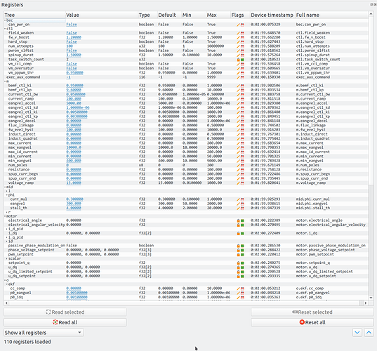
I am thinking that putting the parameter list into the node detail view, as I made in the original gooey tool, was a mistake. We also need to keep in mind that we don’t really have “parameters” per se in UAVCAN v1.0; instead we have “registers”, which are slightly different. The details are doc’ed here: https://github.com/UAVCAN/dsdl/blob/uavcan-v1.0/uavcan/register/384.Access.0.1.uavcan
I described another approach which should work much better here: GUI Tool – Next Generation - #2 by pavel.kirienko (look for “Multi-node concurrent configuration tool”). Basically, it should be like a large table; the horizontal dimension represents nodes (i.e., one column per node), and the vertical dimension represents parameters. Ideally, the parameters should be grouped into a tree-like structure, like this:
Except that, on the screenshot, we’re dealing with only one device; in order to free up the horizontal dimension for other nodes, various register metadata will have to be collapsed into one rich cell: the current value, minimum/maximum/default, data type, edit/reset buttons, flags (editable/persistent), etc. Notice how the tree branches can be expanded and collapsed, this is very convenient. The exact UX/presentation is a matter of discussion, suggestions are highly welcome.
A service request of type uavcan.node.ExecuteCommand should be emitted: https://github.com/UAVCAN/dsdl/blob/uavcan-v1.0/uavcan/node/435.ExecuteCommand.0.1.uavcan
There also should be buttons for other commands, and an option for invoking vendor-specific commands; i.e., with arbitrary user-specified code.
The frontend should not care about the time it takes to update a firmware (for the sake of a general reference, a regular node with ~400 KB large firmware takes about 2 minutes to update itself over CAN 2.0B). The only thing we need the frontend to do is to ask the user for the location of the file, then make this file available to the backend (e.g. upload), and then make the backend call the service. When this is done, the frontend can safely forget the context. See chapter 5 for more info about this process. Nodes may emit progress information while update is ongoing by publishing messages of type uavcan.diagnostic.Record.
